
About
Background
When the news of the global COVID-19 pandemic hit, many institutions found themselves having to scramble to transitioning to a remote work and educational environment. This meant for a lot of “firsts” for everyone. It was the first time some people worked from home, took university classes from home, and even celebrated special occasions virtually.
Problem
Microsoft Teams is one of many applications that allows for people to connect. The primary issue is that there are a lot of people who have never used it before, and they find it difficult to learn in a short period of time.
How might we present a solution to help new users better navigate Microsoft Teams so they can start collaboration faster?
Research
We conducted our research using surveys and interviews.
Our 26 respondents consisted of college students, teaching staff, and remote workers in various professions.
The Conversation
Question
How do you prefer to learn to use an application for the first time?

The highest percentage of users preferred hands-on instruction followed by video instruction. The remainder of users responded with a mixture of other methods, which included learning from their peers or trainers.
Now that we had a starting point. We wanted to identify any collaboration applications that users found particularly cumbersome to use for the first time. Some popular applications being used at the time were: Discord, Skype, Teams, and Zoom. Since Microsoft Teams was more widely used over various professions, we decided to focus our study on this.
Ultimately, we found that 46% of our users reported having difficulty using Teams for the first time.
Question
What would have made using Teams easier for you?

Tutorials that require people to perform tasks of a specific feature versus just showing the feature in the video.

They could include a test run or demonstration that a user can do with the app's features, like video calling.

A quick tutorial whether video or pop-up box providing explanation of the tools/items on the screen.
The Takeaway
Our users prefer having different forms of instruction built in to the application they are learning to use. Those forms of instruction include video, dialogs, or hands-on demonstrations of the application and its features. This meant that our design would need to include some combination of these methods in order to fit our users' needs.
Prototyping
Since we received a mixture of feedback for how the application provides new user training material, we decided we needed to test out different options. We designed two different versions of our low-fidelity prototype. We called Version A the "Guided Tour" and Version B the "Interactive Tutorial".
Version A | Guided Tour
The Guided Tour aligns more with what we would see in video instruction. On first launch, the user would be prompted to take the tour and it would autoplay a demonstration of the features in the app until the user quits or the tour completes.


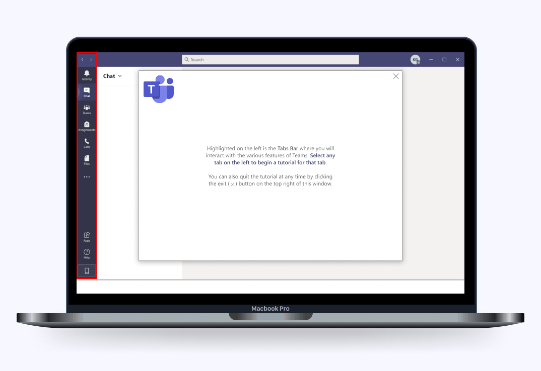
Version B | Interactive Tutorial
The Interactive Tutorial aligns more with a hands-on demonstration. On first launch, the user would be prompted to take the interactive tutorial and would complete each step until they quit or they reach the end of the tutorial.


User Testing
We completed A/B user testing for the low-fidelity designs. We originally predicted users would prefer the Guided Tour, but to our surprise the majority preferred the Interactive Tutorial. With that in mind, we requested further feedback from users on the Interactive Tutorial for our next iteration.
Low Fidelity to High Fidelity Iteration
The feedback we received during our low-fidelity testing was used when translating the design to a high fidelity prototype. Some key changes are shown below.
Changed color of the highlight box from a purple to red and added an animation.
Users noted that the highlight didn't stand out very well, which caused some confusion on where they should be looking during the tutorial. They felt the color needed to be brighter and visibly different from the application's color palette.
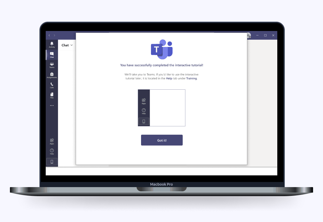
Removed ‘End Tutorial’ button and replaced with an ‘x’ on the top-right corner.
The large button at the bottom of the screen was unnecessary and users felt like an 'x' would be more intuitive since it is more in line with how other applications behave.
Updated verbiage to be more clear and made styling changes to instructions.
Since the instructional text can be quite lengthy, users were getting lost on which actions to take. To fix this, we made changes to the primary instruction to make it stand out better to the user.

Animation
The primary concern we had during user testing was confusion during instruction. Additionally, the problem we were trying to solve was to help users navigate through the application easier rather than overwhelming them even more. In order to work toward that goal, we decided to add animations to the highlighted boxes to direct user attention toward relevant items.
Final Product
Here is our final design. We conducted another round of user testing prior to delivering the final product to ensure our changes followed the feedback we were given on previous testing sessions. We were satisfied to see we were able to design a solution to one of the problems users have been facing during such a rough transition to remote environments.


Retrospective
This was my first UX Design course project. Overall, it was a great learning experience and I had so much fun from start to finish. My favorite parts were user research and designing the prototypes. Although the prototype is limited due to the amount of features in Teams, I’m very proud of the outcome. I’m even more proud to say that a few months after our project, Microsoft implemented their own interactive tutorial into the application. It made me realize that we were in the right direction when completing our project, and I was happy to see their their product team identified and resolved the same user concerns we did.
If I could go back and do one thing over, it would be the low-fidelity prototype. When we conducted user testing, some users were met with confusion on items that we designed. We were trying to focus on not delivering a high-fidelity prototype for the first iteration, but by doing so we eliminated important elements needed for usability testing. For one example, we had image placeholders in black and it distracted users. Additionally, our feature highlighting relied on color and we should have made sure to put that in place before testing. In the end, it allowed us to improve over subsequent iterations and I'm grateful for that. It also made me learn to pay attention to the seemingly smaller details so I could take that knowledge into future design projects.